
Here is a quick graphic design tip for you.
But before I dive into it, I must warn you, there are no scientific studies backing this up.
Just my opinion.
I stopped using pure white and pure black.
They’re killing my eyes…
If I have a pure black background and I use pure white, 10 minutes later my eyes feel like I've been chopping a bunch of onions.
The same goes the other way.
And so, I stopped using them. Instead, I found these two colors to work better. They're not as harsh on my eyes:
#F5F5F5
#FFFAFF
If you have sensitive eyes after looking at your screen for a while, this will help.
There is also another thing I use when I’m glued to the computer screen for a longer period of time, and that is…
Blue Light Glasses.
…which I found to work great in the evening, blocking some of the blue light and reducing the strain on my eyes.
It helps with sleep as well.
There are a ton of brands.
I’ve got simple, cheap glasses off of Amazon, and they work great.
Anyway…
To finish this short email in style…
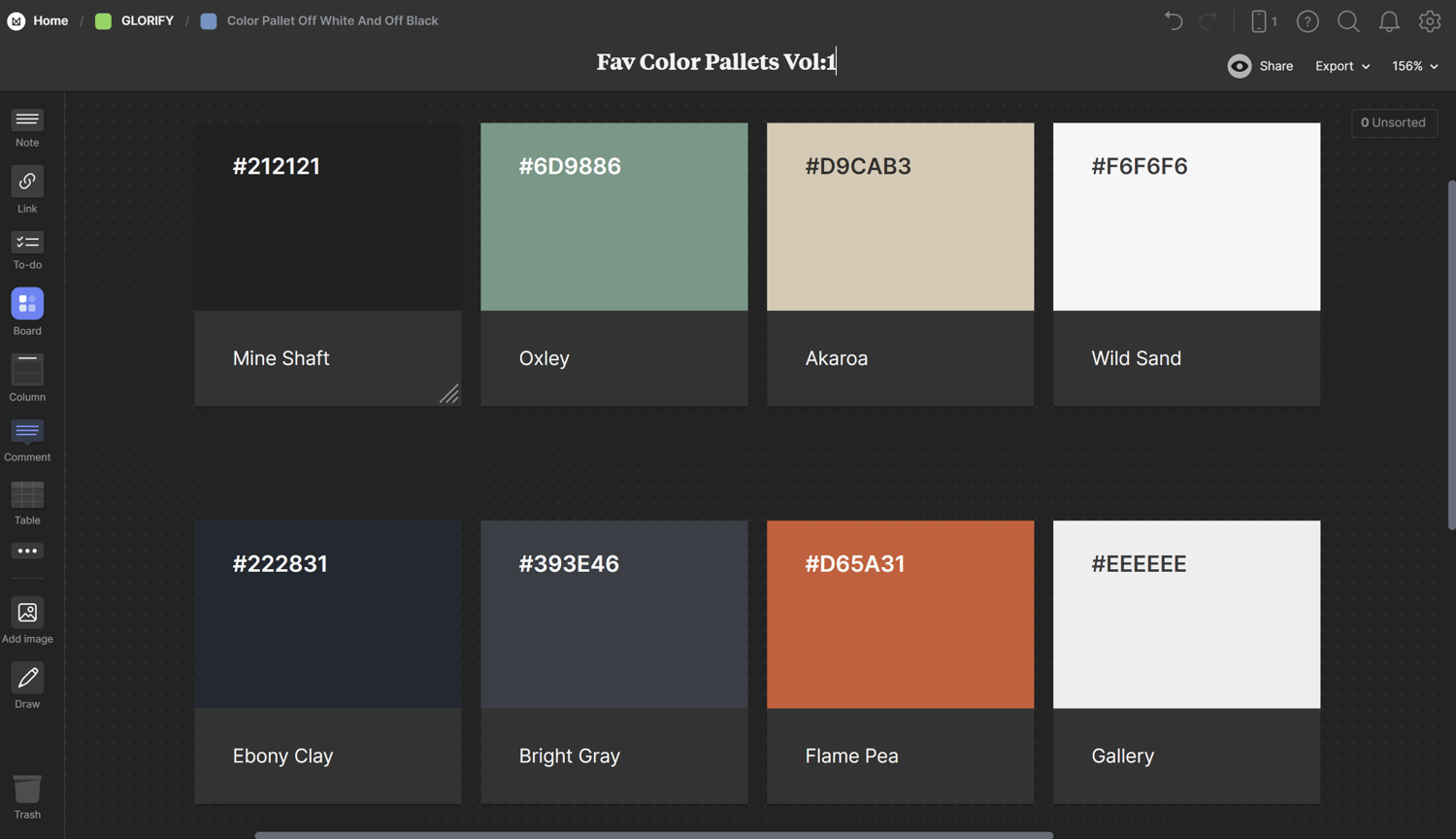
I’m going to leave two of my favorite color palettes I’m using a lot now in my designs. They not only look great but also help with eye strain.
Here they are:
https://app.milanote.com/1RBd4b1ICtqk1v?p=Svk7Arbq9KO
See you tomorrow with another golden tip.
Libor
Comments ()